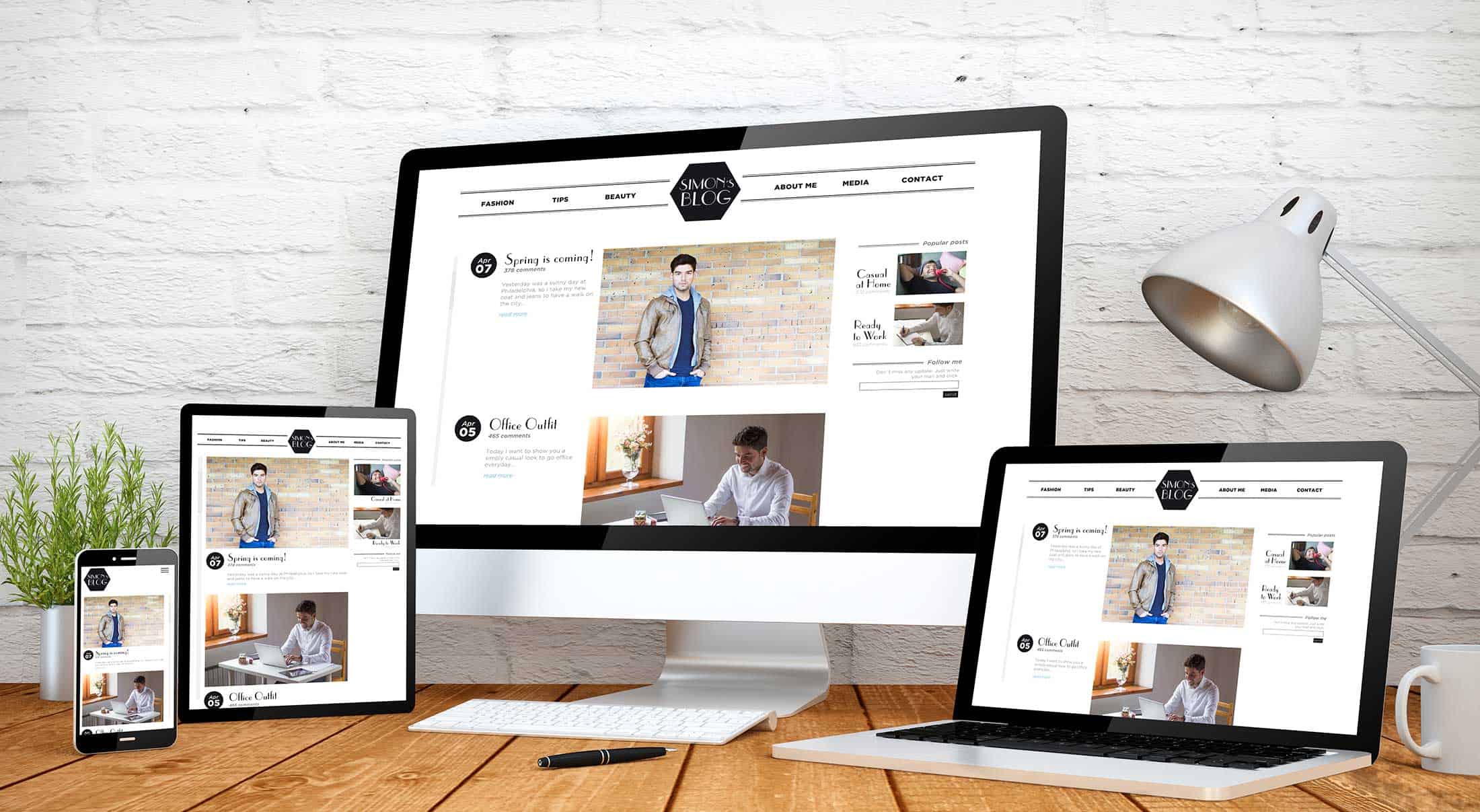
A Great Looking Site for Every User
If you have a mobile site, you have a different site setup that is designed to be seen on a mobile device. The problem is: not all mobile devices are the same. Some people may have a smaller display that needs a very compact setup, while others have a much larger display where your simplified site seems limited.
And what about tablet users? A small tablet isn’t much different from a smartphone, but larger tablets will support something closer to your full website, though not completely. These users might be unsatisfied with your mobile site and with your full site.
A responsive site is designed to recognize the display capabilities of the device it is being viewed on and change itself to match. This means that every user will get a site that is tailored to their display so they get a great experience.
Better Search Performance
Google has said that it prefers a responsive site design for mobile devices. This is consistent with Google’s desire that you show every user—along with the search spiders—the same content. Google wants to make sure that every user gets the same quality experience, and when you have two sets of content for one site, it’s suspicious that you’re trying to perform a bait-and-switch.
Google has also announced that come April 21, the mobile-friendliness of your site will have a major influence on the ranking of your website. If your mobile site isn’t performing for all mobile users, your search results might take a hit.
Focus Your Efforts
Search engine optimization takes a lot of effort. When you’re optimizing a separate mobile site, you have double the efforts. With a single site for all users, you can focus on just one optimization and save yourself time—and money.