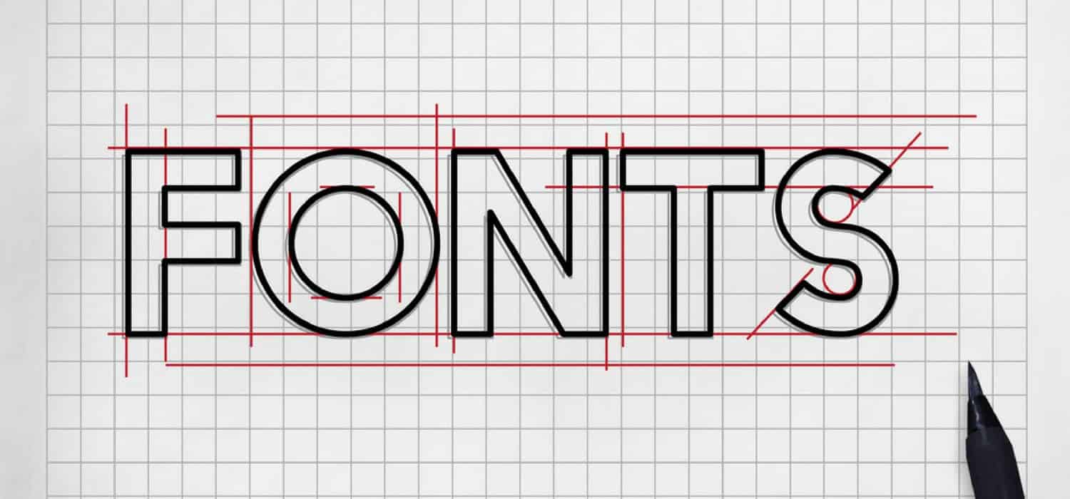
Choosing the right font pairing is important for any type of marketing, but especially when you’re creating a website. Fonts can convey the mood, context and deeper meanings beyond just words on a page.
There are certain guidelines to follow when pairing fonts, but not many unbreakable rules. The biggest rule to follow–the fonts being paired should always complement one another. Most of the time, it’s a good idea to pair fonts together that are of the same family. A great example of this can be seen when pairing serifs with sans serifs. Serifs usually contain a small flair at the end of each character stroke while sans serifs, as the name implies, are devoid of the flairs at the end of the stroke.
Also, if you can find fonts that are members of super-families, then you will have your choice of styles, classifications and line weights to choose from with the added bonus that each of the fonts are designed to complement each other. All this being said, let’s take a look at 15 of the most common font pairings and discuss how they complement each other. ![]()
This font pairing is an example of a serif and san serif pairing that complement each other. Playfair Display is usually used for the heading, because of its flair. Then Source Sans Pro is chosen as the paragraph text because of its readability.
![]()
These fonts pair well as heading and text because they look similar, but the Raleway lends itself to the bold context and looks better as the heading. Ubuntu is evenly spaced, and the characters are nice and even.
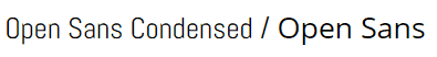
The Open Sans Google font is very versatile. It is very readable in large blocks of text and headings. It can be used for almost any purpose. The condensed version makes maximum use of character spacing, which makes it great for the block text while using Open Sans for the headings.
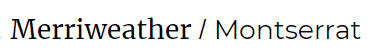
These fonts are actually interchangeable as headings and text. Merriweather is a good match because of its easy readability and contrasting style. Montserrat is very versatile in its simplicity and is often used by designers.
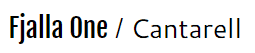
Commanding attention in headlines is Fjalla One’s bread and butter. It’s not the most versatile font, but it’s attention-grabbing style make it a great headliner font. Cantarell is the same with paragraph text. It doesn’t work for everything, but is very readable and pairs well with more flashy fonts.
![]()
These two fonts find themselves mostly in the business world on documents for attorneys and business people. Oswald works great for headlines no matter its weight and line style while Droid Serif is very classical and similar to fonts usually reserved for literature as it’s very easy to read in paragraph text.
![]()
These fonts are on the less serious side and convey more of an artistic, whimsical feel. You wouldn’t want to use Amatic SC for your body text because it would drive your readers mad, but it’s great for catching attention as a headliner.
![]()
This futuristic family of fonts finds themselves most at home in technical publications. However, they are very versatile and can be used on most any typographic project. They are very clear, evenly spaced and easy to read.
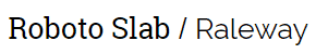
This is the serif version in the Roboto family. It’s also very versatile but has a more classical style than its other family members. It pairs very well with Raleway when used in all caps as a bold heading.
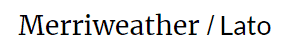
Lato is great for computers because it works at different resolutions. Merriweather is also very skimmable and is great for long blog posts that readers want to go through quickly.
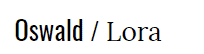
Oswald is an attention catcher while Lora is a very clean and professional serif font. They pair very well together as headliner and paragraph text.
![]()
Both are very readable on computer screens. Montserrat is good for things such as navigational menus on websites. Vollkorn is a good choice for small blocks of text on websites. These fonts pair well together on web pages.
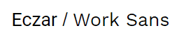
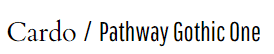
Eczar is a very exotic font and can be used in various weights. It’s great for headlines, but having to stare at it throughout a paragraph would be very tedious. That’s where Work Sans comes in. It is very flowy and easy to read and lends itself to paragraph text.
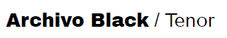
For bold, attention-grabbing headlines, Archivo Black is hard to beat. Then Tenor complements it by being very easy to consume in the detail headings of magazine articles.
You’ve probably seen these two fonts used together on calendars and schedules of events and itineraries. They lend themselves to highlighting small blocks of short text in sequences.
Which Font Pairing Should You Use?
There are infinite pairings of fonts that can be used for a myriad of reasons. Some are very versatile while others are very specific. Some are great for headlines, but would soon drive you mad if you were to use them while writing a paragraph. Remember Comic Sans Serif? Very whimsical in email signatures, but you would pull your hair out having to read a short blog post composed entirely of that font.
Some fonts are great for paragraph text on computer screens because they are easy to read and won’t tire out your eyes while others are better suited for books and magazines because they are sharper on printed pages and provide better contrast. Additionally, you’ll want to consider how a font looks at specific sizes. This is because font size affects the total line length or how many words fit across your content area. Too long and the user feels like they are reading an essay. Too short and the user feels they are reading a children's book.
The best advice we can give is to look at your project as a whole before publishing a new page. If it looks good and conveys the impression that you’re trying to get across, then consider yourself a winner. The biggest issue seen with font pairing tends to be when people want to get too fancy or overly artistic with their project. When text is too busy on a page, it can work against you and deter site visitors from wanting to stick around.
Have questions about your web pages and whether or not you’re using the best font pairings for your content? Contact us today and let us help you out!